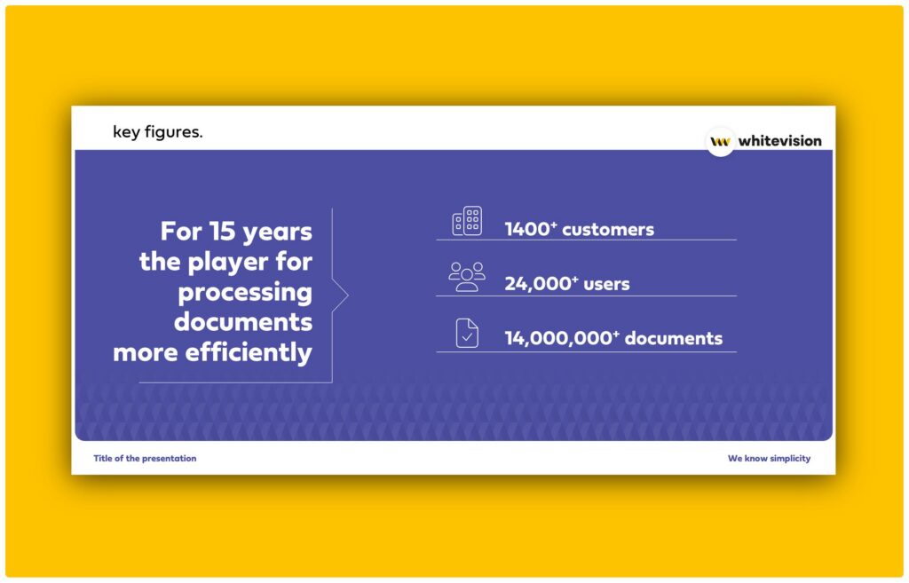
The pattern grows out of the symbol. It connects elements and carries our authenticity — quietly.
The house style contains a pattern that comes out of the symbol. It can be laid over a photo or over a background colour, and it connects elements: it is the thing that makes a page ours without a logo having to say so.
Using the pattern
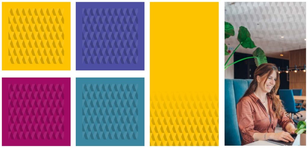
Opacity 20% or lower, always fading to 0
Above 20% it starts competing with the content — especially on light shades. As a rule of thumb it takes about one and a half rows to fade from 20 to 0.
Always with a bleed
The pattern runs off the edge; it is never a framed panel.
Scale to the surface
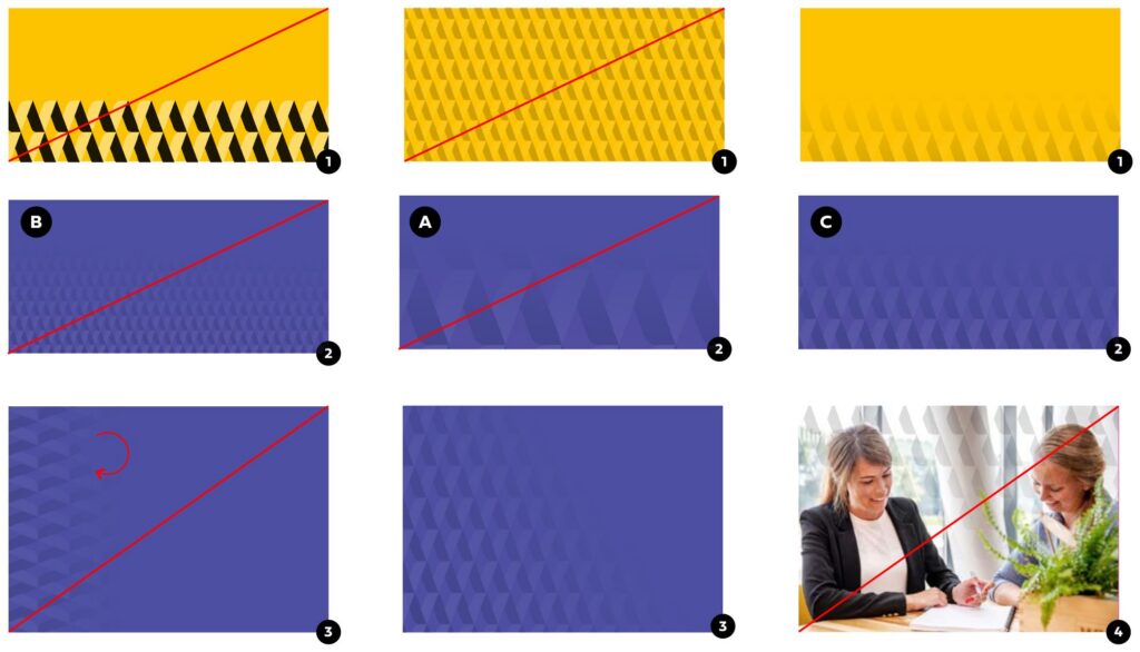
Roughly ten tiles across the width of the block. On a block 20 cm wide, count twenty small blocks from left to right.
Never rotate it
Rotating changes the shape and it stops reading as Whitevision. Play with the direction of the fade instead — that can run any way you like.
Keep it off faces
On photography, the pattern never runs over or through someone’s face.
A ratio is hard to write down and comes down to feel. Too coarse and the pattern turns into a graphic in its own right; too fine and it disappears into texture. In the plate below, A is too coarse and B too fine — C is the one you want.
Rounded corners
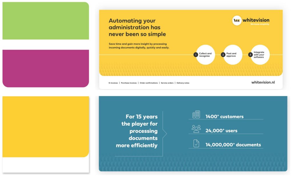
Blocks with one or two rounded corners run all through the house style. They give the work a friendly, accessible character — one corner left square keeps it from turning into a pill.
Online — 20 px
The same radius everywhere, whatever the block size.
A5 — 4 mm
Print radii scale with the format.
A4 — 5.6 mm
A3 — 8 mm
A2 — 10.2 mm
Icons and infographics
For icons we use Font Awesome Pro v6 — more than 26,000 of them in thin, light, regular and bold, plus the official social marks under Font Awesome Brands. If an icon does not tell the right story, we draw our own in the same style and line weight.
Light or thin, as a rule
The lighter weights are what make the icons feel like ours rather than like a toolbar.
Black, in colour, or knocked out
Knocked out of a coloured block is the version you will use most.
One weight per surface
Do not mix light and regular icons in the same diagram.
Colour may do more work here
In an infographic several colours are fine, as long as each one is doing a job. The moment a colour is decorative, take it out.