
What it looks like once it has all been used together. Steal from these before starting from a blank page.
Everything on the pages before this one is a rule in isolation. This is what they look like stacked up: colour, blocks and typography doing their jobs at the same time. When you are starting something new, begin here rather than with an empty artboard.
Colour, blocks and typography
Campaigns
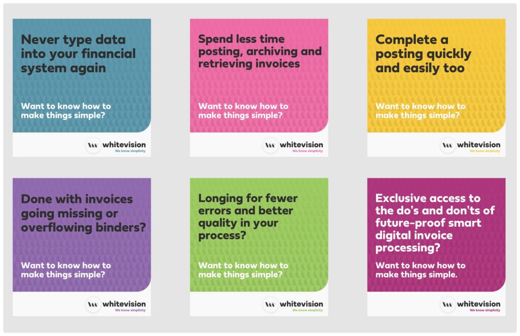
Our campaign creative is one repeated shape: name something the reader already finds annoying, ask the simplicity question, sign it with the pay-off. Every ad in the set uses the same construction and a different colour, so the run reads as a family rather than as six separate ads.
The pain, in their words
“Never type data into your financial system again.” “Done with invoices going missing or overflowing binders?”
The question
“Want to know how to make things simple?” Always the same, always lighter, underneath.
The pay-off
“We know simplicity”, bottom right, on white.
One colour per ad
Rotate through the palette across the set. Never two colours in one ad.
Presentations and the website
One idea per slide
If the slide has two headings it is two slides.
The quote slide
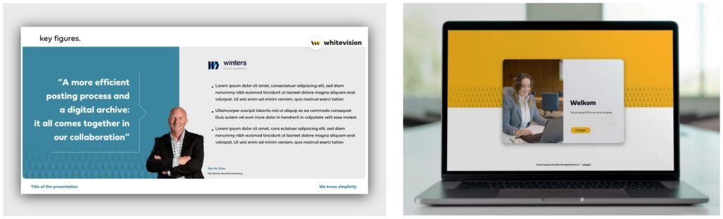
A customer quote set large on white, with the name and company underneath. The most persuasive slide in any deck — use it early.
Key figures over sentences
A number set large says more than the paragraph explaining it. Put the paragraph in the notes.
Montserrat, not Fieldwork
PowerPoint will not have Fieldwork installed on the machine you present from.
E-mail signature
We each send more e-mail than marketing sends campaigns, so the signature is the most-seen thing we make. It is deliberately plain: name in bold, role under it, mobile then office, the address, and the logo with the pay-off. Nothing after the logo.
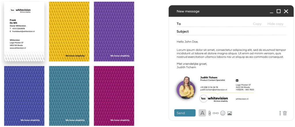
Ask marketing for the signature generator rather than copying a colleague’s — that is how old addresses and the previous logo keep circulating.
Trade fairs and giveaways
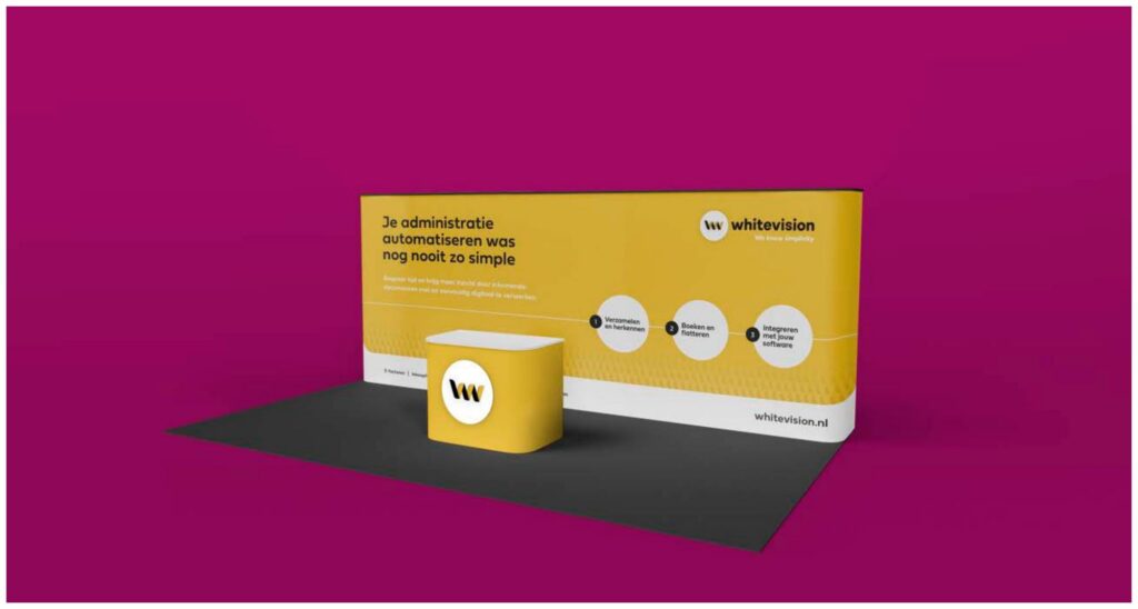
One statement, readable from ten metres
The wall carries a headline, not a product list.
Yellow leads
A stand is one of the few places the whole palette would be a mistake.
The pattern at full bleed
Large scale, low opacity, running off the panel.
A giveaway people keep
On a small object the symbol alone reads better — one of the cases the logo rules allow for. One colour per object.
Ready to go?
Grab what you need from Downloads, and if you want something made — a webinar, a blog, a news item, a page — send a content request and marketing will pick it up.