
The new white is colorful. Colour gives our message extra impact — as long as one colour leads.
Energy, happiness, cheerful and positive.
Harmony, trust.
Natural, balance and freshness.
Decisiveness, counsel and mediation.
Well-being, spirituality, wisdom and magic.
Organisational, supportive and heart-warming.
Passion, love, youthfulness.
What each colour says
Approachable yellow
Energy, happiness and positivity. The colour that leads.
Natural green
Natural, balance and freshness.
Collaborative petrol green
Harmony and trust.
Friendly purple
Decisiveness, counsel and mediation.
Wise purple
Well-being, spirituality, wisdom and magic.
Caring fuchsia
Organisational, supportive and heart-warming.
Feminine pink
Passion, love and youthfulness.
What is allowed, and what is not
One dominant colour per block
Plus at most one extra. White and black do not count as colours.
Several colours only when they clarify
In infographics or animations, as long as they make the complex simpler.
Contrast comes first
Enough contrast between the typography and the coloured background.
RGB and CMYK will differ
The two colour spaces do not cover the same spectrum.
Combinations
With a palette this wide the temptation to combine is strong. The rule is one colour per page, plus black and white. On a colour block, typography is always white or black — that keeps legibility high. Type on a white background may be set in one of the house-style colours.
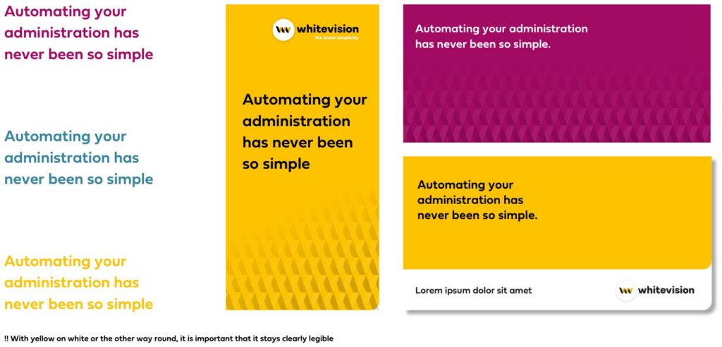
On a colour block, set type in white or black — nothing else.
Small white type on yellow, or the reverse. A large heading can carry it; body text cannot.